

Android 16 vs iOS 26: Liquid Glass Meets Material 3 Expressive – A UX Expert’s Deep Dive
By Mo, PhD in AI and UX Design | Techmo
Hey there, tech enthusiasts! I’m Mo, your guide at Techmo, and I hold a doctoral degree in the intersection of AI and UX design. With WWDC 2025 and Google’s Android 16 QPR1 Beta 1 behind us, we’re witnessing a clash of titans: iOS 26 with its bold Liquid Glass redesign and Android 16 with the vibrant Material 3 Expressive design. Apple’s iOS 26 is their most ambitious UI overhaul since iOS 7, while Google’s iterative update builds on Material You’s foundation. As a UX expert, I’ve spent hours testing both betas on a Pixel 9 and iPhone 16, and let me tell you—this comparison is a rollercoaster of innovation, usability issues, and polarizing design choices.

In this in-depth guide, we’ll compare Android 16 vs iOS 26 across design, usability, AI features, and more, focusing on the Liquid Glass and Material 3 Expressive philosophies. I’ll share my expert insights, highlight pros and cons, and predict the impact of these updates. Whether you’re Team Android or Team iPhone, this post will help you decide which OS suits your needs in 2025. Let’s dive in!
Why This Comparison Matters
Announced in June 2025, iOS 26 introduces a visionOS-inspired Liquid Glass design, emphasizing translucency, reflections, and dynamic animations across apps, Control Center, and the Lock Screen. Meanwhile, Android 16, rolling out to Pixel 6 and later devices, refines Material You with Material 3 Expressive, focusing on bold colors, springy animations, and haptic feedback for a user-friendly experience. Both OSes aim to personalize and modernize, but their approaches differ significantly, sparking debates about aesthetics, functionality, and accessibility.
What You’ll Learn:
- How Liquid Glass and Material 3 Expressive compare in design and usability
- Key feature updates in quick settings, browsers, notifications, and more
- AI advancements and their impact on user experience
- Usability issues and accessibility concerns
- Which OS is better for you in 2025
1. Design Philosophy: Liquid Glass vs Material 3 Expressive
iOS 26: Liquid Glass – A Glossy, Polarizing Redesign
Apple’s Liquid Glass is a system-wide overhaul, applying translucent, glass-like effects to app icons, buttons, Control Center, and notifications. Inspired by visionOS, it utilizes real-time rendering to replicate glass’s light refraction, featuring specular highlights that shift in response to device movement. The result? A shiny, futuristic UI that’s visually striking but controversial.
- Home Screen: App icons glow with a glossy, layered look, offering a “Clear” mode for full transparency. The Lock Screen clock dynamically adjusts size based on wallpaper content.
- Control Center: A transparent grid of circular icons, but readability suffers due to excessive translucency.
- Notifications: Glassy overlays make text hard to read, especially with vibrant wallpapers.
- App Redesigns: Apps like Safari, Camera, and Messages adopt the glassy aesthetic, with floating tab bars and dynamic elements.
My Take: The Liquid Glass design is a bold statement, but it’s not calling users to action. Glass isn’t a clickable material—it feels decorative, not functional. As a UX expert, I’m concerned about visibility: even with 20/20 vision, I struggled to read text in Control Center and notifications due to dominant background icons. I initially thought the UI was a bug and reset my iPhone 16! This echoes Windows Vista’s Aero Glass, which was ditched for similar reasons.

Android 16: Material 3 Expressive – Vibrant and Functional
Google’s Material 3 Expressive builds on Material You, introduced in Android 12, with bold colors, rounded shapes, and enhanced haptic feedback. It’s less a redesign and more a refinement, prioritizing usability and customization.
- Home Screen: Subtle transparency in the App Drawer and Lock Screen, with adaptive color palettes based on wallpapers.
- Quick Settings: Larger, pill-shaped toggles with a blurred, semi-transparent background for better readability.
- Animations: Springy animations and satisfying haptics make interactions feel responsive.
- Customization: Smarter theming adjusts UI elements to match user preferences, maintaining clarity.
My Take: Material 3 Expressive feels warmer and more intuitive than Liquid Glass. The blurred backgrounds ensure readability, and haptic feedback adds a tactile layer to actions like dismissing notifications. It’s a quality-of-life upgrade, not a flashy overhaul, which aligns with Google’s iterative approach.
Winner: Android 16. Liquid Glass is visually stunning but sacrifices functionality for aesthetics. Material 3 Expressive balances form and function, making it easier to navigate.
Pro Tip: On iOS 26, enable Reduced Transparency in Settings > Accessibility > Display to improve readability. On Android 16, customize your theme in Settings > Wallpaper & Style for a personalized look.
2. Quick Settings: Accessibility and Usability
iOS 26 Control Center
Access the Control Center by swiping down from the top-right corner. The redesigned interface is fully transparent with glossy icons, but it’s a usability nightmare:
- Visibility Issues: The transparent background blends with app icons, making it hard to distinguish toggles like Wi-Fi or Bluetooth.
- Crowded Layout: The grid of circular icons feels cluttered, and text is often illegible against busy wallpapers.
- Customization: You can adjust modes (e.g., Dark, Light), but the glassy design doesn’t invite interaction.
My Take: The Control Center looks cool but feels like a step back. The lack of visual hierarchy and poor contrast make it hard to find the right button, especially in bright environments.
Android 16 Quick Settings
Access Quick Settings by swiping down twice or using two fingers. Material 3 Expressive introduces subtle but effective changes:
- Dual-Action Toggles: Click the inner button to toggle (e.g., turn Wi-Fi on/off) and the outer area to access settings (e.g., select a Wi-Fi network).
- Blurred Background: A semi-transparent, blurred background ensures readability without sacrificing style.
- Haptic Feedback: Enhanced haptics make interactions feel precise and satisfying.
My Take: Android 16’s Quick Settings are intuitive and practical. The dual-action toggles streamline tasks, and the blurred background avoids the visibility issues plaguing iOS 26.
Winner: Android 16. Its Quick Settings are more accessible and user-friendly, with clear visual cues and responsive feedback.
Action Step: On Android 16, customize Quick Settings in Settings > System > Quick Settings to prioritize your most-used toggles. On iOS 26, tweak Control Center layout in Settings > Control Center to reduce clutter.
3. Default Browsers: Safari vs Chrome
Safari (iOS 26)
Safari’s redesign in iOS 26 prioritizes screen real estate and accessibility:
- Bottom Search Bar: The address bar is at the bottom, making it easier to reach on larger iPhones.
- Collapsible UI: The search bar minimizes during scrolling, giving you a full-screen browsing experience.
- Glassy Elements: The URL bar and back buttons adopt the Liquid Glass look, but readability is decent due to solid backgrounds in most web pages.
My Take: Placing the search bar at the bottom is a usability win, especially for one-handed use. The collapsible UI maximizes content visibility, making Safari feel spacious on smaller screens like the iPhone 16.
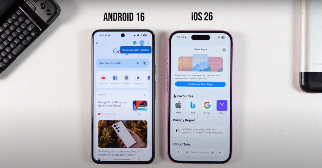
Chrome (Android 16)
Chrome in Android 16 retains its familiar layout with Material 3 Expressive tweaks:
- Top Search Bar: The address bar remains at the top, which can be less accessible on larger devices.
- Haptic Enhancements: New animations and haptics make tab switching and scrolling feel smoother.
- Theming: Adaptive colors sync with your wallpaper, creating a cohesive look.
My Take: Chrome’s design is solid but doesn’t innovate as much as Safari. The top search bar feels dated on tall screens, and while haptics are nice, they don’t transform the experience.
Winner: iOS 26. Safari’s bottom search bar and collapsible UI are more user-friendly, especially for smaller devices.
Pro Tip: On iOS 26, enable Single Tab mode in Safari > Settings for a cleaner browsing experience. On Android 16, use Chrome Flags to experiment with new UI features.
4. Notifications: Readability and Functionality
iOS 26 Notifications
Notifications in iOS 26 use the Liquid Glass design, with translucent overlays that reflect the wallpaper:
- Usability Issues: Text is often unreadable due to excessive transparency, especially with bright or busy backgrounds.
- Swipe Gestures: Swipe left to reveal options (e.g., reply, delete), but the glassy effect obscures these menus.
- Unknown Senders: Messages from unknown contacts go to a dedicated folder, improving organization.
My Take: The glassy notifications look futuristic but are a usability disaster. I struggled to read alerts, and the lack of contrast makes quick interactions frustrating.
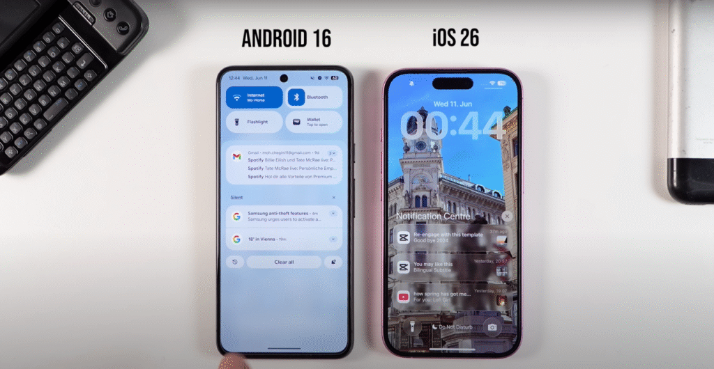
Android 16 Notifications
Android 16 enhances notifications with Material 3 Expressive:
- Notification History: Dismissed notifications are saved, preserving deep links to app pages or promotions.
- Haptic Feedback: A satisfying vibration when dismissing notifications adds tactile feedback.
- Blurred Background: Semi-transparent blur ensures readability, even with vibrant wallpapers.
My Take: Android 16’s notification history is a game-changer for recovering accidentally અ
System: accidentally dismissed notifications, and the haptic feedback makes interactions intuitive. Material 3 Expressive’s blurred backgrounds are a significant improvement over Liquid Glass’s transparency, ensuring clarity.
Winner: Android 16. Notification history and better readability make it a clear winner over iOS 26’s problematic design.
Action Step: On Android 16, check Settings > Notifications > Notification History to recover dismissed alerts. On iOS 26, adjust notification settings in Settings > Notifications to prioritize critical apps.
5. Recent Apps and Multitasking
iOS 26 Recent Apps
The recent apps view in iOS 26 stacks apps over each other, allowing you to swipe through them:
- No Major Changes: The interface remains largely unchanged, with smooth animations but no new functionality.
- Dynamic Island: Enhances multitasking by displaying minimized apps (e.g., Spotify) with quick controls.
My Take: The Dynamic Island is a standout feature, offering quick access to app controls without opening them fully. However, the recent apps view feels dated compared to Android’s multitasking capabilities.

Android 16 Recent Apps
Android 16’s recent apps are displayed side by side, with a key improvement:
- Menu Bar Shortcuts: Tap the menu bar to access settings like split-screen mode, enabling two apps to run simultaneously.
- Haptic Feedback: Enhanced haptics make navigation feel responsive.
My Take: Split-screen multitasking is a productivity booster, and the menu bar shortcuts streamline app management. Android 16 feels more versatile for power users.
Winner: Android 16. Split-screen multitasking and menu bar shortcuts offer more flexibility than iOS 26’s static recent apps view.
Pro Tip: On Android 16, enable split-screen mode by tapping the menu bar in the recent apps view and selecting another app. On iOS 26, use the Dynamic Island for quick app interactions.
6. AI Features: Circle to Search vs Visual Intelligence
iOS 26 Visual Intelligence
iOS 26 introduces a Circle to Search-like feature powered by Apple Intelligence:
- Screenshot-Based Search: Take a screenshot, circle an object, and get intelligent results (e.g., identifying a plant) with ChatGPT integration.
- Live Translation: Real-time text and audio translation in Messages, FaceTime, and Phone, processed on-device for privacy.
- Accessibility: Supports multiple languages, including English, Spanish, and Japanese.
My Take: Visual Intelligence is smart but less seamless than Android’s equivalent due to the screenshot requirement. Live Translation is a privacy-focused win, though.
Android 16 Circle to Search
Android 16 refines Google’s Circle to Search:
- Direct Access: Hold the home button or gesture bar, circle an object, and search instantly without a screenshot.
- Gemini Integration: Leverages Google’s AI for accurate, context-aware results.
- Live Updates: Time-sensitive notifications for food delivery, navigation, and rideshare apps.
My Take: Circle to Search is faster and more intuitive, and Live Updates add practical functionality. Android’s AI feels more mature and integrated.
Winner: Android 16. Circle to Search’s direct access and broader AI integration outshine iOS 26’s screenshot-based approach.
Action Step: On iOS 26, try Visual Intelligence by taking a screenshot and circling an object in the Photos app. On Android 16, hold the gesture bar to activate Circle to Search anywhere on the screen.
7. Camera App: Simplicity vs Functionality
iOS 26 Camera
The Camera app in iOS 26 is minimalist, with a focus on simplicity:
- Simplified UI: Only Photo and Video modes are visible; swipe to access Portrait or other modes.
- Hidden Settings: Swipe up for advanced settings like format and resolution, reducing clutter.
- Glassy Design: Buttons and previews adopt the Liquid Glass look, but readability is decent.
My Take: As a power user, I find the minimalism restrictive, but user studies might prove it’s less overwhelming for casual users. The swipe-based modes reduce accidental taps but slow down access.

Android 16 Camera
Google’s Pixel Camera in Android 16 retains its robust feature set:
- Visible Modes: Photo, Video, Portrait, and more are accessible in a row, with Material 3 Expressive styling.
- Haptic Feedback: Enhanced haptics make mode switching feel tactile.
- AI Enhancements: Features like Audio Magic Eraser and improved Night Sight leverage Gemini AI.
My Take: The Camera app is more intuitive for power users, with visible modes and AI-driven tools. Material 3 Expressive adds polish without sacrificing functionality.
Winner: Android 16. The Camera app offers more flexibility and AI power, catering to both casual and advanced users.
Pro Tip: On iOS 26, swipe up in the Camera app to access format settings for content creation. On Android 16, explore Camera > Settings > More Settings for AI-enhanced options.
8. Additional Features
iOS 26 Highlights
- Dynamic Island: Quick controls for minimized apps like Spotify are a unique advantage.
- Stacked Widgets: Stack widgets to save Home Screen space, a feature Android lacks.
- Spatial Photos: Convert photos to 3D spatial images, though Beta 1 has bugs.
- Back Gesture: A larger swipe area improves navigation, addressing the fat finger principle.
My Take: The Dynamic Island and stacked widgets are productivity wins, but spatial photos need polish. The back gesture improvement is a step forward but inconsistent compared to Android.
Android 16 Highlights
- Weather Wallpapers: Dynamic wallpapers reflect real-time weather conditions.
- Media Controls: Separate volume sliders for media, calls, notifications, and alarms.
- Hearing Device Support: Native control for hearing aids, enhancing accessibility.
My Take: Weather wallpapers add personality, and separate volume controls are practical. Android’s accessibility focus is a strong point.
Winner: Tie. iOS 26’s Dynamic Island and widgets are innovative, but Android 16’s practical features like weather wallpapers and media controls match them.
Action Step: On iOS 26, stack widgets in Edit Home Screen mode to save space. On Android 16, enable weather wallpapers in Settings > Wallpaper & Style.
9. Usability and Accessibility Issues
iOS 26 Usability Challenges
- Readability: Excessive transparency in Control Center, notifications, and search bar reduces legibility.
- Accessibility: Glassy effects may pose challenges for users with visual impairments.
- Performance: Beta 1 causes overheating and battery drain on iPhone 15 Pro, likely due to graphics-heavy effects.
My Take: Liquid Glass prioritizes aesthetics over functionality, creating a cold, less intuitive experience. Apple needs to tweak transparency before the iPhone 17 launch in September 2025.
Android 16 Usability Strengths
- Clarity: Blurred backgrounds and bold colors ensure readability across UI elements.
- Haptic Feedback: Enhances accessibility by providing tactile cues for actions.
- Customization: Adaptive theming caters to diverse user needs, improving accessibility.
My Take: Material 3 Expressive is a usability triumph, balancing style and function. It’s more inclusive and intuitive than Liquid Glass.
Winner: Android 16. Its focus on clarity, haptics, and customization makes it more accessible and user-friendly.
Pro Tip: On iOS 26, use Settings > Accessibility > Display > Increase Contrast to improve legibility. On Android 16, adjust accessibility settings in Settings > Accessibility for personalized usability.
10. Performance and Stability
iOS 26 Beta 1
- Overheating: Graphics-heavy Liquid Glass effects cause heat issues on iPhone 15 Pro and 16.
- Battery Drain: Noticeable battery consumption, especially on older devices (iPhone 11 and up supported, XR/XS dropped).
- Bugs: Spatial photos, focus mode overlaps, and animation stutters are common.
My Take: As a developer beta, iOS 26 is expectedly unstable. Apple has until September 2025 to address these issues, but the glassy design may strain hardware.
Android 16 QPR1 Beta 1
- Stability: Smoother performance on Pixel 6 and later, with fewer reported bugs.
- Battery Life: Efficient, with adaptive power modes optimizing usage.
- Rollout: Available OTA for Pixel devices, with broader rollout planned.
My Take: Android 16 feels more polished, benefiting from Google’s iterative approach. It’s less demanding on hardware than iOS 26’s graphics-heavy UI.
Winner: Android 16. It’s more stable and efficient in Beta 1, with fewer performance issues.
Action Step: On iOS 26, monitor battery usage in Settings > Battery and disable unnecessary animations. On Android 16, enable Battery Saver in Settings > Battery for extended life.
Should You Try the Betas?
iOS 26 Beta 1
- Pros: Stunning Liquid Glass design, innovative features like Dynamic Island and Visual Intelligence.
- Cons: Readability issues, overheating, battery drain, and bugs make it unstable for daily use.
- Recommendation: Install on a secondary device if you’re a developer or enthusiast. Wait for the public beta in July 2025 or the stable release in September 2025.
Android 16 QPR1 Beta 1
- Pros: User-friendly Material 3 Expressive, notification history, and stable performance.
- Cons: Less dramatic redesign may disappoint users seeking a bold change.
- Recommendation: Safe for early adopters on Pixel devices, but ensure backups due to beta risks.
My Take: Android 16 is the safer beta for now, offering a more polished experience. iOS 26’s Liquid Glass needs significant tweaks to match its usability.
Pro Tip: Back up your device before installing any beta. On iOS, use iCloud Backup in Settings > [Your Name] > iCloud. On Android, go to Settings > System > Backup.
Conclusion: Which OS Wins in 2025?
iOS 26 dazzles with its Liquid Glass redesign, but usability issues like poor readability and performance hiccups make it feel like a step back. Features like the Dynamic Island, Safari’s collapsible UI, and Visual Intelligence are innovative, but the glassy aesthetic sacrifices functionality for flair. Apple has time to refine it before the iPhone 17 launch, but it’s a risky bet.
Android 16 refines Material You with Material 3 Expressive, delivering a balanced, user-friendly experience. Notification history, split-screen multitasking, and Circle to Search enhance productivity, while blurred backgrounds and haptics ensure accessibility. It’s less revolutionary but more practical.
Verdict: Android 16 wins for its usability, stability, and mature AI features. iOS 26 is a bold experiment, but its focus on aesthetics over function makes it less intuitive. If you prioritize customization and clarity, Android 16 is the better choice. If you love cutting-edge design and can tolerate beta quirks, iOS 26 offers a glimpse of Apple’s future.
What’s your take on Android 16 vs iOS 26? Are you excited for Liquid Glass or sticking with Material 3 Expressive? Drop your thoughts in the comments, and subscribe to Techmo for more tech insights! Check out my comparison of the iPhone 16 Pro Max vs Galaxy S25 Ultra next.
Disclaimer: Beta software is unstable and may cause data loss. Always back up your device before installing. Results may vary based on device and usage.
FAQs
iOS 26’s Liquid Glass design focuses on translucent, visionOS-inspired aesthetics, while Android 16’s Material 3 Expressive emphasizes bold colors, haptics, and usability. iOS 26 struggles with readability, while Android 16 prioritizes clarity and customization.
iOS 26 supports iPhone 11 and newer (excluding iPhone XR and iPhone XS).
Yes, enable Reduced Transparency in Settings > Accessibility > Display to reduce glassy effects and improve readability.