Nothing OS 3.0 Beta: A Deep Dive into New Features, Design, and User Experience
Introduction: Nothing OS 3.0 Beta – A Glimpse into the Future
In the fast-evolving world of smartphones, every software update is a step toward either innovation or refinement. Nothing OS 3.0 Beta brings its flavor of change, merging new features with aesthetic shifts that offer a fresh user experience. Nothing has made waves in the tech world by pushing boundaries with unique design elements and quirky brand identity. But does Nothing OS 3.0 Beta keep up the momentum or compromise its individuality?
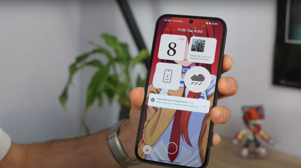
In this in-depth blog post, we’ll examine the new features of Nothing OS 3.0 Beta and their impact on the overall user experience. We will look at design changes, and functional improvements, and assess whether this update sets a new standard or dilutes the originality of the Nothing brand.
What’s New in Nothing OS 3.0 Beta?
The Nothing OS 3.0 Beta update brings several key changes, from aesthetic tweaks to functionality enhancements. Let’s dive into what’s been introduced:
1. Aesthetic Overhaul: New Looks and Designs
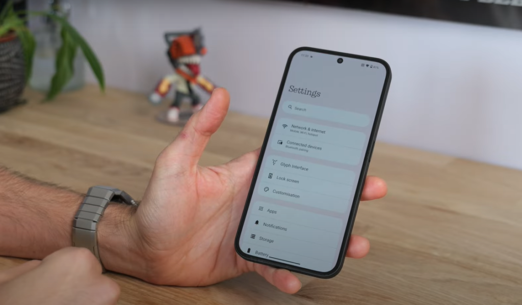
One of the first noticeable changes in Nothing OS 3.0 is the redesign of the UI. While some elements remain familiar, new animations and fonts give the OS a new feel.
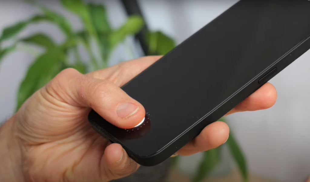
- Fingerprint Animation: A new dot-expanding fingerprint animation gives a sleek touch when unlocking the phone. It’s minimal, modern, and subtly engaging.
- Charging Animation: The charging animation is now a bit more sophisticated and stylish, adding a small, enjoyable touch to the experience of plugging in your phone.User Reaction: These visual tweaks might seem trivial, but they reflect Nothing’s attention to detail. These tiny improvements bring a sense of freshness, even though they don’t impact functionality in a meaningful way.
| Feature | Previous Version | Nothing OS 3.0 Beta |
|---|---|---|
| Fingerprint Animation | Simple circular animation | Expanding dot animation |
| Charging Animation | Basic battery fill animation | Enhanced visual effect |
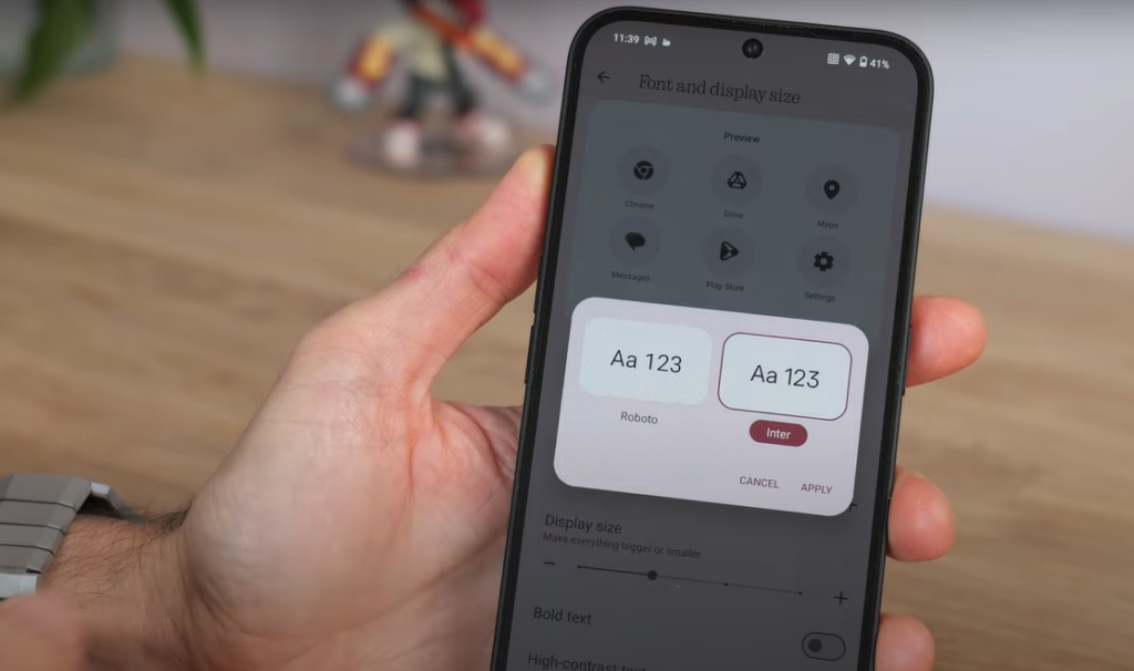
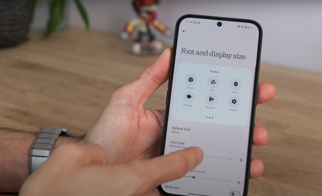
| Font | Dot Matrix (Unique to Nothing) | Roboto and Inter (More Generic) |
- Font Change – Roboto vs Dot Matrix: Perhaps the most controversial change is the removal of the dot matrix font. Nothing OS 3.0 Beta replaces it with the more conventional Roboto and Inter fonts. While Roboto is easier to read and has a more professional feel, this change diminishes the uniqueness that once defined Nothing’s design. Why It Matters: Fonts play a critical role in brand identity, and Nothing’s dot matrix design sets it apart from rivals. Switching to a more generic font feels like a loss of personality. Though functional, it’s a bit of a letdown for long-time fans.
2. UI Updates: Functional and Visual Changes
The changes don’t stop at aesthetics. Nothing OS 3.0 Beta introduces functional upgrades that make navigation smoother and personalization deeper. Below are some of the highlights:
Notification Panel
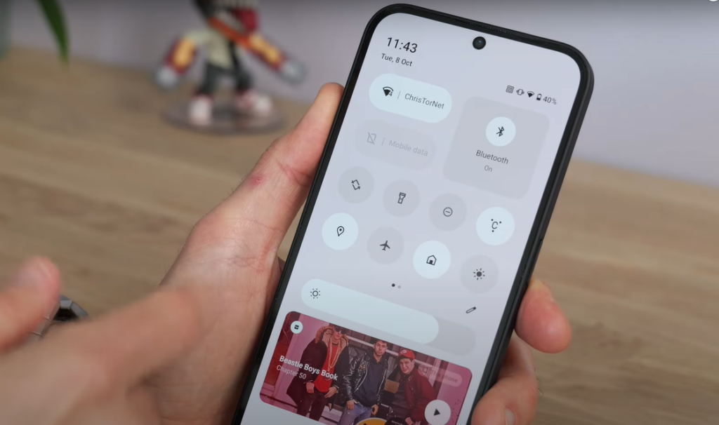
- New Quick Toggles: The notification panel now features a mix of rounded and pill-shaped quick toggles. Users can resize these toggles, creating a more personalized quick settings menu.Key Features:
- Quick tap to resize toggles.
- Customizable layout with the ability to fill gaps.
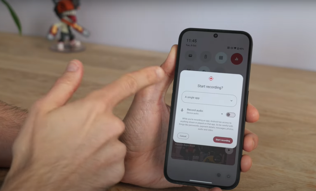
- Screen Recording Upgrade: You can now record a single app instead of the entire screen. This feature is excellent for content creators or anyone who needs to capture specific app footage without revealing private information in other apps.Use Case Example: Let’s say you’re recording a tutorial in a game. With Nothing OS 3.0 Beta, you can record just the game app, even if you momentarily minimize the app to check a message. The recording will remain focused on the app itself.
Lock Screen Customization
- Nothing OS 3.0 Beta brings a more customizable lock screen, which offers:
- Different clock styles, including the familiar dot matrix clock.Expanded widget area, allowing users to add a variety of widgets, including calendar, weather, and app shortcuts.
- Clock Styles: Roboto, Dot Matrix, Minimalist.Widgets: Ability to add and resize widgets like weather, fitness, etc.
3. App Drawer and Widgets: Smarter and More Organized
The app drawer and widget interface have also received significant updates in Nothing OS 3.0 Beta. These features offer a mix of new organization and smart suggestions:
App Drawer Enhancements
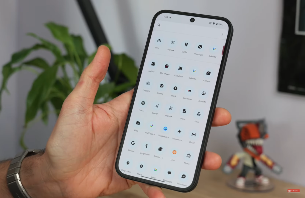
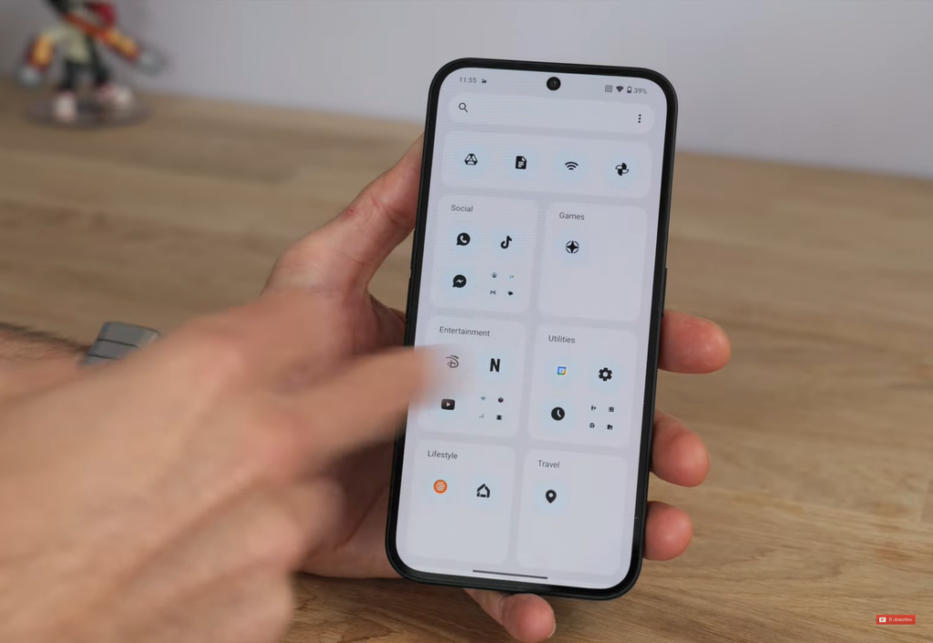
- Smart Suggestions: The top of the app drawer now features smart suggestions based on app usage patterns.
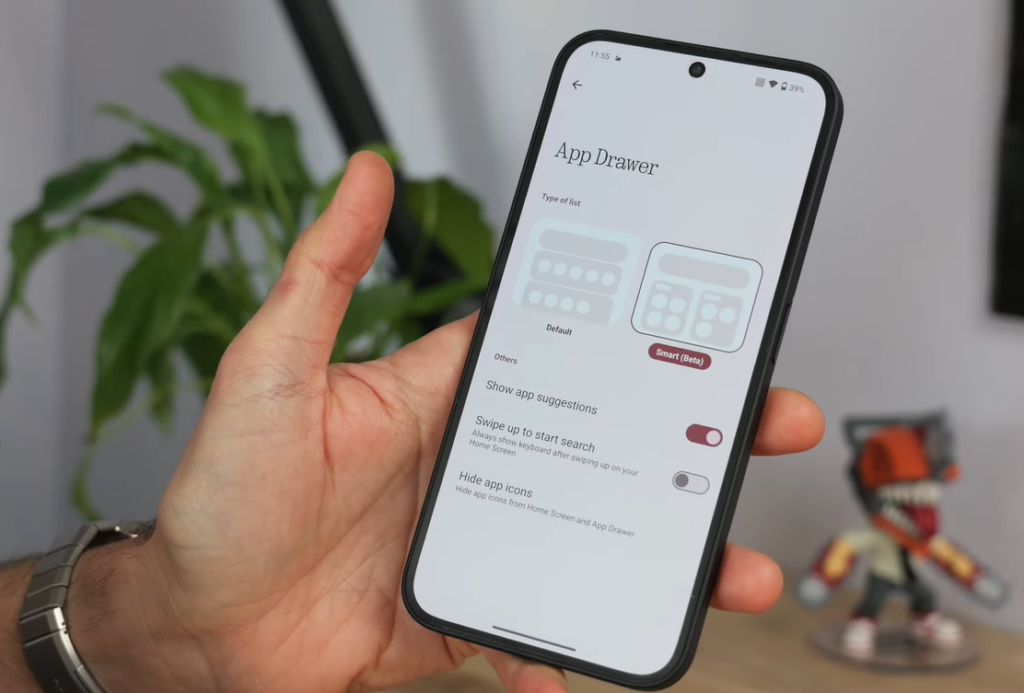
- Smart Beta App Drawer: Users can switch to a more iOS-like app drawer, which organizes apps based on usage rather than alphabetically.User Tip: For those who prefer traditional organization, the old alphabetic order option is still available. This allows users to choose between simplicity and enhanced functionality.
| Feature | Description |
|---|---|
| App Drawer | Two modes: Standard alphabetical or Smart Beta (iOS-like organization based on app usage). |
| Smart Suggestions | Suggests apps based on recent activity. |
Widget Menu Update
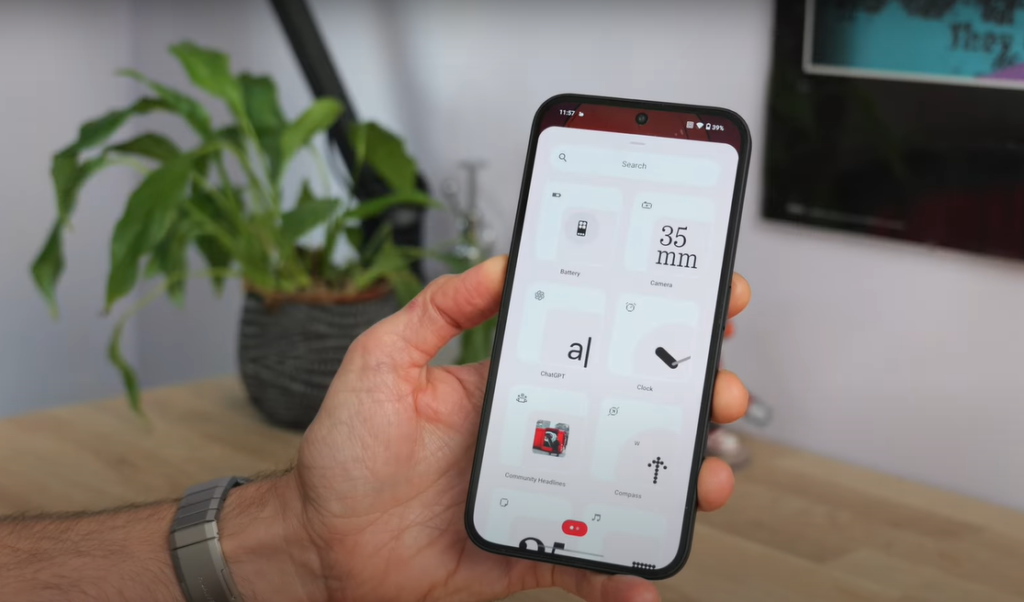
- The widget menu has been reorganized for easier navigation. It now separates Nothing-specific widgets from general Android widgets, offering a cleaner experience.
- There’s also a new date widget that can count down to special occasions like birthdays or holidays, though it might require some figuring out to activate.
4. Multitasking Improvements: Pop-Up View
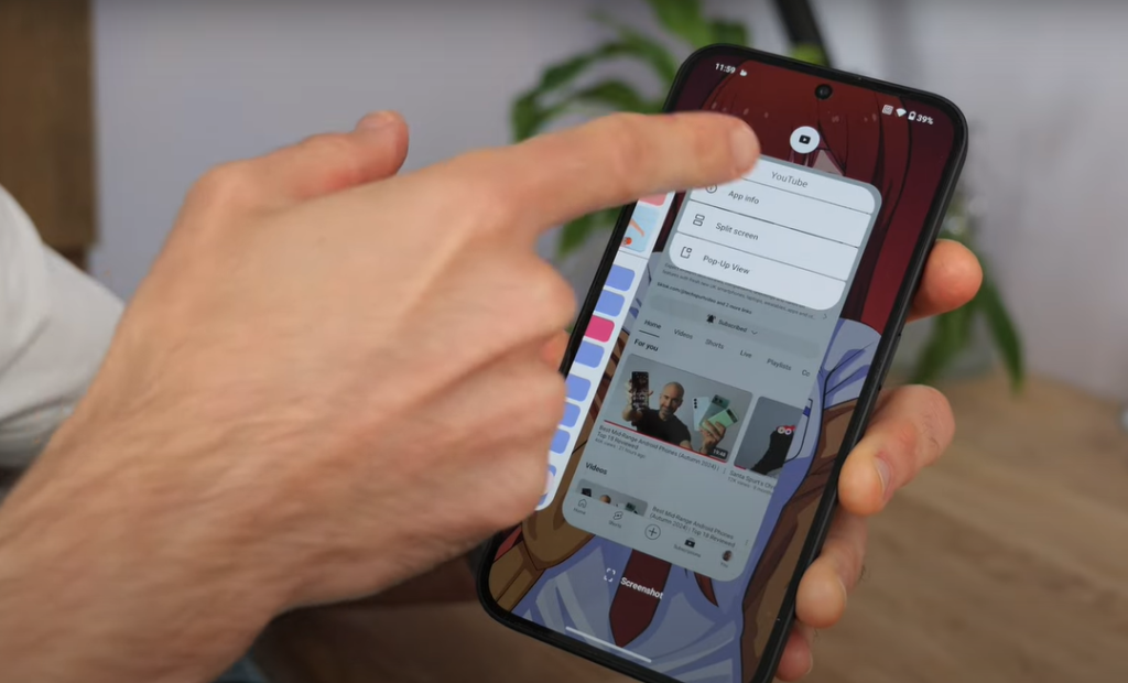
Multitasking is a breeze with the new pop-up view. This feature allows users to open an app in a small window, resize it, and move it around the screen as needed.
Pop-up View Features:
- Resizable Window: The window can be resized by dragging the corners, making multitasking smoother.
- Edge Hide: If you need the app temporarily out of sight, you can hide it on the screen’s edge and bring it back with a simple tap.Benefit: Multitaskers will find this feature highly useful for managing several apps without cluttering the screen.
5. Camera App Enhancements: Faster and Smarter
One area where Nothing OS 3.0 Beta has made substantial improvements is the camera app. Although the changes are subtle, they make a noticeable difference in day-to-day use:
- Faster Launch Time: The camera app now opens faster, though the speed improvement might be marginal on newer devices like the Nothing Phone 2.
- Reduced HDR Processing Time: Nothing has reduced HDR processing times to around 2-3 seconds, making it quicker to capture and process high-dynamic-range photos.
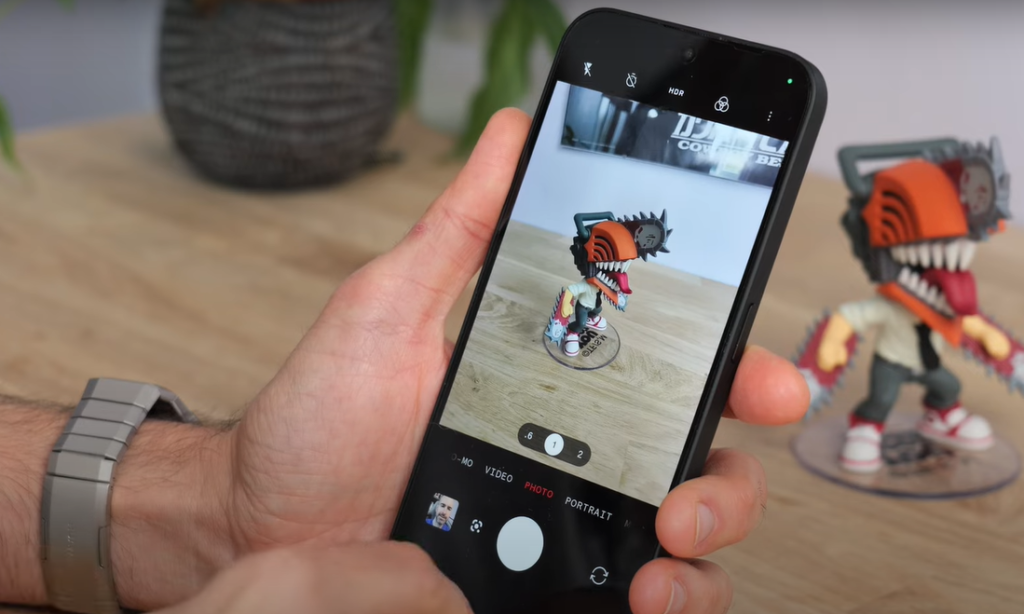
Portrait Mode and Low-Light Performance
- Portrait Mode: Improved portrait mode adjusts the blur intensity based on the subject’s distance. This enhancement creates a sharper separation between the subject and the background.
- Low-Light Performance: Nighttime shots are now brighter and less grainy, thanks to enhanced low-light processing.
| Feature | Description |
|---|---|
| Camera Launch Speed | Faster launch times, especially on newer devices like Nothing Phone 2. |
| HDR Processing Time | Reduced to 2-3 seconds for quicker, high-quality shots. |
| Portrait Mode | Adjusts blur intensity automatically based on subject distance. |
| Low-Light Mode | Brighter, less grainy nighttime photos with enhanced detail. |
6. User Experience: How Does It All Come Together?
While Nothing OS 3.0 Beta is packed with changes, the overall user experience is a mix of innovation and subtle compromises. Here’s what stands out:
Pros:
- Improved Functionality: Features like app-specific screen recording, pop-up view multitasking, and lock screen customization improve daily use.
- Camera Enhancements: Faster camera operations and smarter portrait/low-light modes offer tangible improvements for photography enthusiasts.
- Increased Customization: Users have more control over how their notifications, lock screens, and app drawers look and function.
Cons:
- Loss of Identity: The shift to Roboto font and more conventional UI elements could alienate fans who loved Nothing’s distinct visual language.
- Learning Curve: Some features, like the new date widget and app drawer, require a bit of user experimentation to get the hang of.
Conclusion: Does Nothing OS 3.0 Beta Live Up to the Hype?
The Nothing OS 3.0 Beta is a promising update, bringing some meaningful changes in terms of usability and customization. For tech enthusiasts who crave control over their devices, the new lock screen features, widget flexibility, and smart suggestions will be welcome additions. The improved camera performance will also appeal to users who value quick and high-quality photo results.
However, the update’s aesthetic shifts, particularly the move away from Nothing’s original design elements, may leave some users nostalgic for the brand’s initial quirky appeal.
Should You Update?
- If you’re excited about trying the new multitasking and camera features or want more customization options, this update is a must.
- If you’re a fan of Nothing’s dot matrix design, however, you may find the new fonts and UI changes disappointing.
In the end, Nothing OS 3.0 Beta is a solid upgrade for users who value performance and personalization, but it may feel like a compromise in design for those who fell in love with Nothing’s uniqueness.
FAQs About Nothing OS 3.0 Beta
The most notable design change is the shift from the dot matrix font to the more conventional Roboto font, making the UI feel more generic.
The new pop-up view allows for easier multitasking, enabling users to resize and hide app windows as needed.
Yes, the camera app opens faster, HDR processing time has reduced, and low-light performance has improved.
Yes, users can customize clock styles, and add widgets, and shortcuts for a more personalized lock screen experience.
Nothing OS 3.0 Beta introduces a smart app drawer that organizes apps based on usage and offers smart suggestions for frequently used apps.

